Css基础教程(二十五)
grid布局实现tab效果
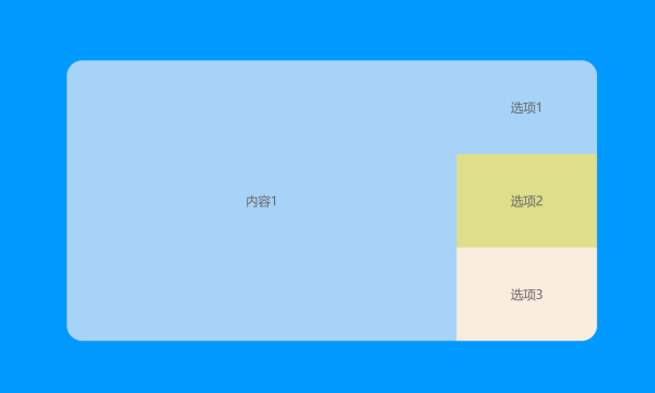
我们可以使用grid布局,轻松实现tab效果。
1.grid布局实现tab
<!DOCTYPE html>
<html lang="en">
<head>
    <meta charset="UTF-8">
    <title>grid布局</title>
    <style>
        body{
            background-color: #0099FF;
            color: #fff;
            font-family: sans-serif;
        }

        #main{
            margin: 120px auto;
            width: 680px;
            height: 360px;
            background-color: #a8d3f8;
            display: grid;
            grid-template-rows: 120px 120px 120px;
            grid-template-columns: 500px 180px;
            gap: 0px;
            overflow: hidden;
            border-radius: 20px;
        }

        input{
            display: none;
        }

        #tabs{
            grid-row: 1/4;
            grid-column: 1/2;
            transition: 1s;
            color: #666;
        }

        #l1,#l2,#l3{
            grid-column: 2/3;
        }

        #l1{
            background-color: #a8d3f8;
            grid-row: 1/2;
        }
        #l2{
            background-color: #dede8b;
            grid-row: 2/3;
        }

        #l3{
            background-color: #faecdf;
            grid-row: 3/4;
        }

        .tab_s{
            width: 500px;
            height: 360px;
        }

        .tab_s :first-child{
            background-color: #a8d3f8;
        }

        .tab_s:nth-child(2){
            background-color: #DEDE8BFF;
        }

        .tab_s:nth-child(3){
            background-color: #faecdf;
        }

        #b1:checked ~ #tabs{
           transform : translateY(0px)
        }

        #b2:checked ~ #tabs{
            transform : translateY(-360px)
        }

        #b3:checked ~ #tabs{
            transform : translateY(-720px)
        }

        label{
            text-align: center;
            line-height: 120px;
            color: #666;
        }

        #l1:hover{
            cursor: pointer;
            background-color: #6AB5F6FF;
        }

        #l2:hover{
            cursor: pointer;
            background-color: #E5E56EFF;
        }

        #l3:hover{
            cursor: pointer;
            background-color: #F8E2CEFF;
        }

        .tab_s{
            text-align: center;
            line-height: 360px;
        }

    </style>
</head>
<body>
<div id="main">
    <input type="radio" name="button" id="b1">
    <input type="radio" name="button" id="b2">
    <input type="radio" name="button" id="b3">
    <label for="b1" id="l1">选项1</label>
    <label for="b2" id="l2">选项2</label>
    <label for="b3" id="l3">选项3</label>
    <div id="tabs">
        <div class="tab_s">内容1</div>
        <div class="tab_s">内容2</div>
        <div class="tab_s">内容3</div>
    </div>
</div>
</body>
</html>
运行效果: