Css基础教程(二十四)
CSS3实现奥运五环效果
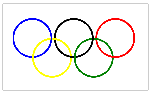
CSS3实现一个奥运五环旗帜效果。
1.CSS3奥运五环效果
<!DOCTYPE html>
<html>
<head>
    <meta charset="UTF-8">
    <title>Title</title>
    <style>
        * {
            margin: 0;
            padding: 0;
        }

        .inner {
            margin-top: 80px;
            margin-left: 50px;
            width: 200px;
            height: 200px;
            border: 10px solid;
            border-radius: 50%;
            float: left;
            position: absolute;
            /*
            text-align: center;
            line-height: 200px;*/
        }

        #main{
            width: 800px;
            height: 480px;
            margin: 0 auto;
            position: relative;
            border: 5px solid #ccc;
            border-radius: 8px;
        }

        .inner::after {
            width: 200px;
            height: 200px;
            border: 10px solid;
            border-radius: 50%;
            float: left;
            position: absolute;
            content: "";
            left: -10px;
            top: -10px;
        }

        #blue {
            border-color: blue;
            top: 0;
            left: 0;
        }


        #blue::after {
            border-color: blue;
            z-index: 1;
            border-bottom-color: transparent;
        }


        #black {
            border-color: black;
            top: 0;
            left: 230px;
        }


        #black::after {
            border-color: black;
            z-index: 1;
            border-left-color: transparent;
        }


        #red {
            border-color: red;
            top: 0;
            left: 460px;
        }

        #red::after {
            border-color: red;
            z-index: 1;
            border-left-color: transparent;
        }

        #yellow {
            border-color: yellow;
            top: 110px;
            left: 110px;
        }

        #yellow::after {
            border-color: yellow;
        }


        #green {
            border-color: green;
            top: 110px;
            left: 340px;
        }

        #green::after {
            border-color: green;
            z-index: 1;
            border-top-color: transparent;
            border-right-color: transparent;
        }
    </style>
</head>
<body>
<br>
<div id="main">
    <div class="inner" id="blue"></div>
    <div class="inner" id="black"></div>
    <div class="inner" id="red"></div>
    <div class="inner" id="yellow"></div>
    <div class="inner" id="green"></div>
</div>
</body>
</html>
运行效果: