Css基础教程(二十三)
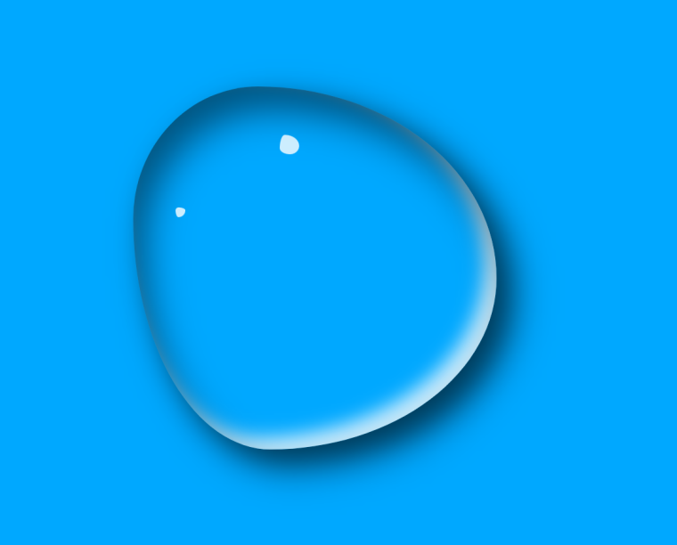
实现水滴效果
使用CSS3的动画特效,实现一个水滴效果。
水滴的自定义边框特效,借助以下网站实现:
https://9elements.github.io/fancy-border-radius/
1.源码如下
<!DOCTYPE html>
<html lang="en">
<head>
    <meta charset="UTF-8">
    <title>Title</title>
    <style>
        * {
            margin: 0;
            padding: 0;
        }

        body {
            box-sizing: border-box;
            width: 100vw;
            height: 100vh;
            display: flex;
            justify-content: center;
            background-color: #00a8ff;
        }

        #water {
            margin-top: 100px;
            width: 300px;
            height: 300px;

            /*border: 1px solid #000;*/

            border-radius: 38% 62% 54% 46% / 63% 64% 36% 37%;
            box-shadow: inset 10px 20px 30px rgba(0, 0, 0, 0.5),
            10px 10px 20px rgba(0, 0, 0, 0.3),
            15px 15px 30px rgba(0, 0, 0, 0.5),
            inset -10px -10px 15px rgba(255, 255, 255, 0.8);
            animation: action 5s linear infinite alternate;
            cursor: pointer;
        }

        #water:after {
            content: '';
            width: 16px;
            height: 16px;
            position: absolute;
            top: 140px;
            left: 48%;
            background-color: rgba(255, 255, 255, 0.8);
            border-radius: 26% 74% 47% 53% / 68% 57% 43% 32%;

        }

        #water:before {
            content: '';
            width: 8px;
            height: 8px;
            position: absolute;
            top: 200px;
            left: 42%;
            background-color: rgba(255, 255, 255, 0.8);
            border-radius: 30% 70% 70% 30% / 30% 30% 70% 70%;
        }

        @keyframes action {
            25% {
                border-radius: 30% 70% 70% 30% / 30% 47% 53% 70%;
            }
            50% {
                border-radius: 52% 48% 31% 69% / 62% 76% 24% 38%;
            }
            100% {
                border-radius: 35% 65% 57% 43% / 50% 48% 52% 50%;
            }
        }

    </style>
</head>
<body>
<div id="water"></div>
</body>
</html>
运行效果: