UniApp基础教程(十三)
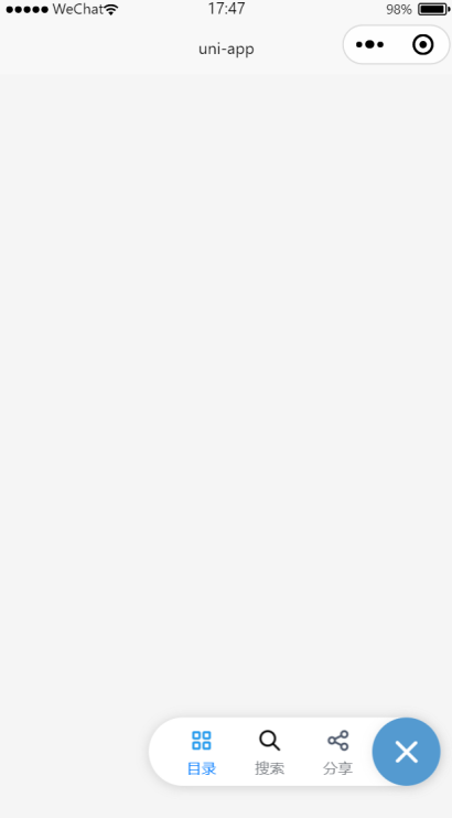
悬浮按钮和弹出层效果
uni-fab 是点击可展开一个图形按钮菜单组件。uni-popup 弹出层组件,用于在应用中弹出一个消息提示窗口、提示框等效果。
1.悬浮按钮和弹出层效果
<template>
<view>
<view class="container">
<uni-fab ref="fab" :pattern="pattern" :content="content" :horizontal="horizontal" :vertical="vertical"
:direction="direction" @trigger="trigger" @fabClick="fabClick" />
</view>
<view>
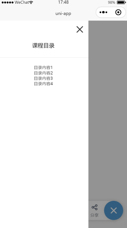
<!-- 普通遮罩层 -->
<uni-popup ref="popup" background-color="#fff">
<view style="padding: 20rpx; text-align: right;">
<uni-icons type="closeempty" size="30" @click="hidePopup"></uni-icons>
</view>
<view class="popup-content" :class="{ 'popup-height': type === 'left' || type === 'right' }">
<text>课程目录</text>
</view>
<u-divider></u-divider>
<view class="text" style="text-align: center;">
<text class="text-item">目录内容1\n</text>
<text class="text-item">目录内容2\n</text>
<text class="text-item">目录内容3\n</text>
<text class="text-item">目录内容4\n</text>
</view>
</uni-popup>
</view>
<view>
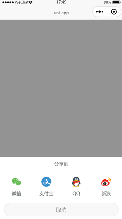
<!-- 分享示例 -->
<uni-popup ref="share" type="share" safeArea backgroundColor="#fff">
<uni-popup-share></uni-popup-share>
</uni-popup>
</view>
</view>
</template>
<script>
export default {
data() {
return {
title: 'uni-fab',
directionStr: '垂直',
horizontal: 'right',
vertical: 'bottom',
direction: 'horizontal',
pattern: {
color: '#7A7E83',
backgroundColor: '#fff',
selectedColor: '#007AFF',
buttonColor: '#549ad0',
iconColor: '#fff'
},
is_color_type: false,
content: [{
iconPath: '/static/fab/unselect/course.png',
selectedIconPath: '/static/fab/selected/course.png',
text: '目录',
active: true
},
{
iconPath: '/static/fab/unselect/search.png',
selectedIconPath: '/static/fab/selected/search.png',
text: '搜索',
active: false
},
{
iconPath: '/static/fab/unselect/share2.png',
selectedIconPath: '/static/fab/selected/share2.png',
text: '分享',
active: false
}
]
}
},
onLoad() {
},
methods: {
trigger(e) {
console.log(e)
for (let i = 0; i < this.content.length; i++) {
if (i == e.index) {
this.content[i].active = true;
} else {
this.content[i].active = false;
}
}
if (e.item.text === '目录') {
this.toggle('left');
}
if(e.item.text === '搜索'){
uni.showModal({
title: '提示',
content: '您选中了搜索',
success: function(res) {
if (res.confirm) {
console.log('用户点击确定')
} else if (res.cancel) {
console.log('用户点击取消')
}
}
})
}
if(e.item.text === '分享'){
this.shareToggle();
}
},
fabClick() {
console.log('点击了悬浮按钮...');
},
toggle(type) {
this.type = type
// open 方法传入参数 等同在 uni-popup 组件上绑定 type属性
this.$refs.popup.open(type);
},
shareToggle() {
this.$refs.share.open()
},
hidePopup() {
this.$refs.popup.close();
}
}
}
</script>
<style lang="scss" scoped>
.container {
width: 98%;
height: auto;
font-size: 14px;
text-align: start;
margin: 0rpx auto;
}
@mixin flex {
/* #ifndef APP-NVUE */
display: flex;
/* #endif */
flex-direction: row;
}
@mixin height {
/* #ifndef APP-NVUE */
height: 100%;
/* #endif */
/* #ifdef APP-NVUE */
flex: 1;
/* #endif */
}
.popup-content {
@include flex;
align-items: center;
justify-content: center;
padding: 10px;
height: 20px;
width: 480rpx;
background-color: #fff;
}
.popup-height {
@include height;
width: 480rpx;
}
.text {
font-size: 12px;
color: #333;
padding: 10rpx;
}
.text-item {
margin: 10rpx;
padding: 10rpx;
height: 20rpx;
}
</style>
运行效果: