UniApp基础教程(六)
轮播和通告栏组件
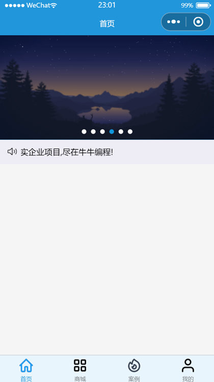
swiper和uni-notice-bar组件分别属于内置组件和uni-ui组件库。
1.实现轮播图和通告栏页面效果
<template>
    <view>
        <view>
            <swiper :indicator-dots="true" indicator-color="white" indicator-active-color="#1296db" :autoplay="true"
                :interval="3000" :duration="1000" :circular="true">
                <swiper-item v-for="(pic,index) in advImgList" :key="index">
                    <view class="swipe-item">
                        <image :src="pic.url"></image>
                    </view>
                </swiper-item>
            </swiper>
        </view>
        <uni-notice-bar show-icon scrollable background-color="#eeecf4" color="444"
            text="求职路上不迷路,面试现场不心慌。海量学习资源,精选案例源码,真实企业项目,尽在牛牛编程!" />
    </view>
</template>

<script>
    export default {
        data() {
            return {
                advImgList: [{
                        title: '',
                        url: "https://img.simoniu.com/wxapp_bg_04.jpg"
                    },
                    {
                        title: '',
                        url: "https://img.simoniu.com/wxapp_bg_01.png"
                    },
                    {
                        title: '',
                        url: "https://img.simoniu.com/wxapp_bg_05.jpg"
                    },
                    {
                        title: '',
                        url: "https://img.simoniu.com/wxapp_bg_02.png"
                    },
                    {
                        title: '',
                        url: "https://img.simoniu.com/wxapp_bg_06.jpg"
                    },
                    {
                        title: '',
                        url: "https://img.simoniu.com/wxapp_bg_03.png"
                    }

                ]
            }
        },
        methods: {
            open() {
                this.$refs.calendar.open();
            },
            confirm(e) {
                console.log(e);
            }
        }
    }
</script>

<style lang="scss">
    /*轮播图*/
    swiper {
        height: 12rem;
        margin-top: -0.7rem;

        .swipe-item,
        image {
            width: 100%;
            height: 100%;
            background-color: #00aaff;
        }
    }

</style>
运行效果: