SaaS星空效果
SaaS星空效果
SaaS星空效果。
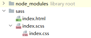
1.项目结构图
2.代码实现
1).index.html
<!DOCTYPE html>
<html lang="en">
<head>
    <meta charset="UTF-8">
    <title>Title</title>
    <link rel="stylesheet" href="https://fonts.googleapis.com/css?family=Lato:300,400,700" type="text/css">
    <link rel="stylesheet" href="./index.css">
</head>
<body>
<div class="layer1"></div>
<div class="layer2"></div>
<div class="layer3"></div>
<div class="title">SaaS 星空</div>
</body>
</html>
2).index.scss
html {
  height: 100%;
  background: radial-gradient(ellipse at bottom, #1b2735 0%, #090a0f 100%);
  overflow: hidden;
}

.title {
  position: absolute;
  top: 50%;
  left: 0;
  right: 0;
  color: #fff;
  text-align: center;
  font-family: 'lato', sans-serif;
  font-weight: 300;
  font-size: 50px;
  letter-spacing: 10px;
  margin-top: -60px;
  padding-left: 10px;
  background: linear-gradient(white, #38495a);
  background-clip: text;
  -webkit-background-clip: text;
  color: transparent;
}

@function createShadow($n) {
  $shadow: '#{random(100)}vw #{random(100)}vh #fff';
  @for $i from 2 through $n {
    $shadow: '#{$shadow},#{random(100)}vw #{random(100)}vh #fff';
  }
  //@return $shadow;
  @return unquote($shadow);
}

$count: 1000;
$duration: 400s;

@for $i from 1 through 3 {
  $count: floor(calc($count / 2));
  //越大的星星移动越快,越小的星星移动越慢
  $duration: floor(calc($duration / 2));

  @debug $count;

  .layer#{$i} {
    $size: #{$i}px;
    position: fixed;
    width: $size;
    height: $size;
    border-radius: 50%;
    left: 0;
    top: 0;
    background: #f40;
    /*box-shadow: 10vw 10vh #fff;*/
    box-shadow: createShadow(200);
    animation: moveUp $duration linear infinite;

    &::after {
      content: '';
      position: fixed;
      left: 0;
      top: 100vh;
      width: inherit;
      height: inherit;
      border-radius: inherit;
      box-shadow: inherit;
    }
  }
}

@keyframes moveUp {
  100% {
    transform: translateY(-100vh);
  }
}
运行效果图: